The power of colours: using psychology to improve your space
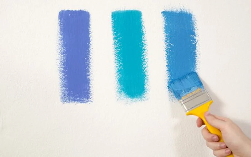
Colours have the power to stir up emotions and affect psychological wellbeing, which is why they play a vital role in the overall look and feel of a space.
Beyond making it look pretty, using the right colour scheme can completely change the mood and atmosphere of a room. This is why mental health experts advocate incorporating colour psychology into the spaces you frequently inhabit.
Here’s what you should know about the way colours and their different combinations can make you feel, plus some handy home-decor tips and tricks.
- Red
Red, which represents excitement, energy, and passion, can stimulate conversation and boost appetites. Do note, however, that too much red can be overwhelming, so use it sparingly as an accent colour to liven up a space. It is best suited to the living room or a game room.
- Orange
Orange, which combines characteristics of red and yellow, similarly fills a room with energy and cheer, providing it a warm and inviting feel. This colour is often used in social spaces and dining areas, where there is frequent and enthusiastic social interaction.
- Yellow
Yellow also represents energy, happiness, and optimism, and is highly recommended for kitchens and playrooms. Use this in spaces where you want to create a vibrant and joyful ambience.
- Green
Green symbolises nature, harmony, and balance, providing a soothing and refreshing effect. Used in a space, it helps to make inhabitants feel rejuvenated. Green is the most recommended colour for offices, living rooms, and spaces that promote relaxation and a connection with nature.
- Blue
This colour is calming and peaceful, and promotes relaxation and serenity. Blue can help boost mental clarity and productivity, which makes it ideal for bedrooms, offices, libraries, and other spaces where focus and concentration are key.
- Purple
This colour brings luxury, creativity, and spirituality into a space, as well as a sense of elegance and sophistication. It is best used in areas where you want to create a visually striking accent. Used wisely, colours can reinforce the intended function of a room. Here are some of the best hues to use, depending on the purpose of a space and the ambience you hope to achieve:
- Home office or study area
Consider calming shades such as blues and greens, which help enhance focus and concentration.
- Living or gaming room
Your best options for social spaces are oranges and yellows, which create a welcoming and lively atmosphere.
- Bedrooms or relaxation area
You want these rooms to feel calm and relaxing, so, again, cooler shades such as blues and purples are your best bet for promoting a sense of tranquility and restfulness.
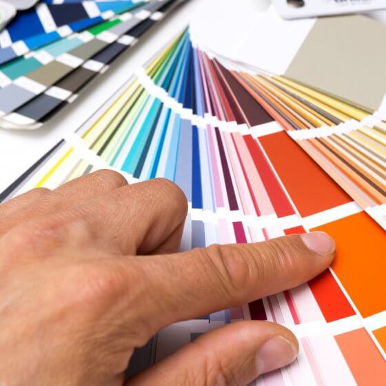
The next step is to develop a colour scheme that ties everything together in the space. A well-thought-out colour scheme will combine a number of hues and make them coexist.
- Monochromatic
For a simple yet elegant look, stick to variations of a single colour. You can use different tints, shades, and tones to help create depth.
- Complementary
The combination is best for backsplash tiles since these colours are positioned across the colour wheel, helping to create contrast and vibrance. Orange and purple are examples of a complementary scheme.
- Analogous
The opposite of a complementary colour scheme, choose colours adjacent to each other on the colour wheel for a harmonious and soothing feel to the room. Red, orange and yellow are examples of an analogous scheme.
- Triadic
With this option, you have to select three evenly spaced colours on the colour wheel to create a balanced combination – for example, red, yellow and blue.
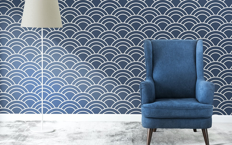
When looking at colour options, do not limit yourself to painted walls. Experimenting with textures and patterns using tiles is a great way to add depth and personality to your space.
Here’s how tiles are a versatile medium for creating unique and eye-catching designs:
- Have a focal point
Create a focal point using vibrant coloured tiles, such as feature walls or kitchen backsplashes.
- Experiment with colours and layout
Create eye-catching patterns by combining different tile colours and layouts. Make sure to choose designs that match your space’s overall decor.
- Add texture
Embossed and raised patterns, as well as 3D tiles are popular today. These can create depth and provide visual appeal to a flat surface.
- Mix and match
Create an interesting surface by mixing tiles of different textures. Build interesting patterns or mosaics, and experiment with different tile shapes, sizes, and finishes.


